DNNK Branding
Denmark's National Network for Climate Adaptation is born
DNNK was founded in response to society’s interest in, and understanding that all good forces must work together across disciplines and organizations to deal with climate adaptation.
The Pixel Hive was hired to create and shape a brand that illustrates and propagates this vision and mission.
What we delivered
• Visual identity design
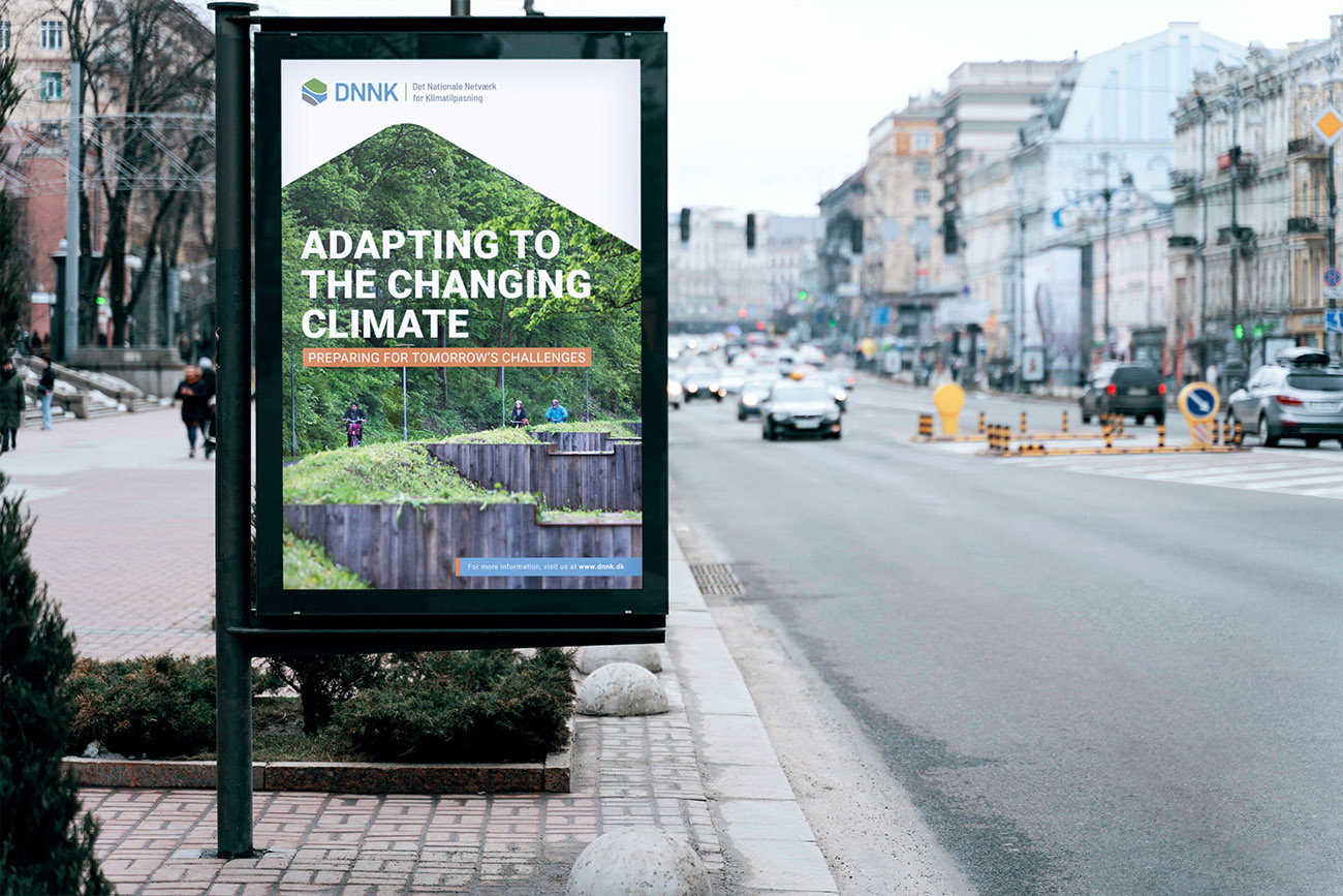
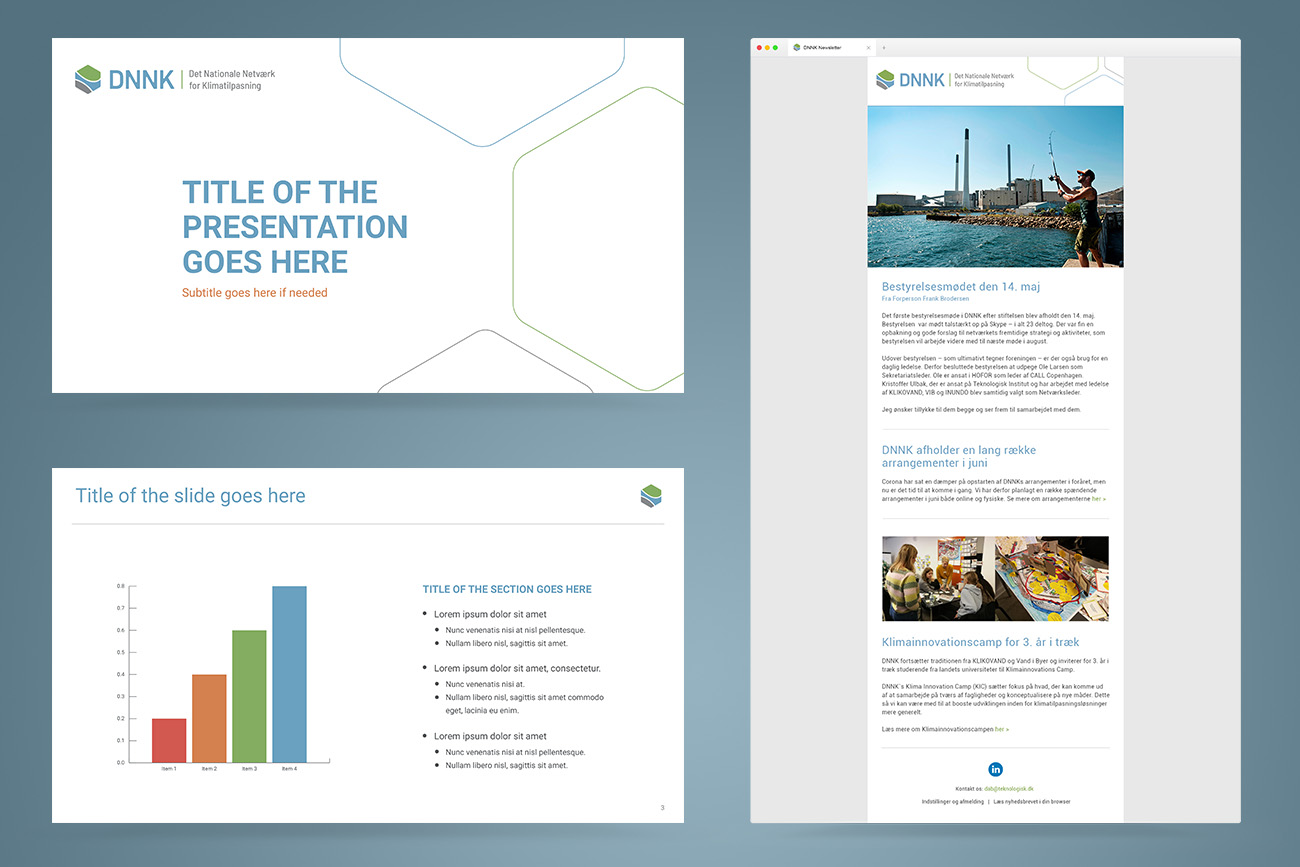
• Brand collateral design
• Brand positioning
• Art Direction
• Consulting
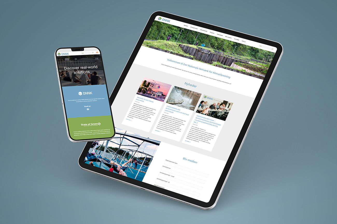
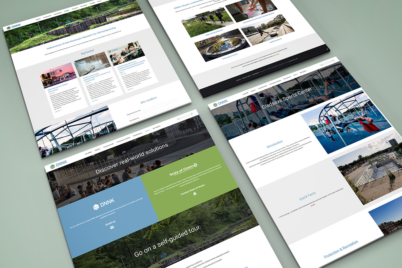
• Web Design
• Graphic Design
Visual Identity
Design Process
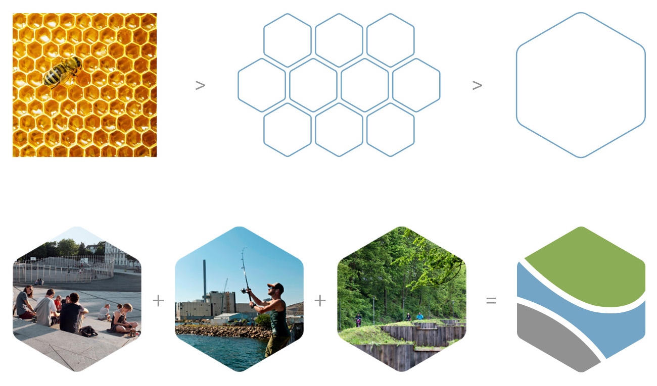
In order to represent the network’s mission and vision through a visual identity, we turned to nature for inspiration. Bees are a network of entities working together as one to achieve a goal that is much bigger than any individual. Through a rigorous design process involving extensive stakeholder feedback we refined the concept into a symbol that incorporates the three main areas DNNK focuses on: Green (plant life), Gray (infrastructure) and Blue (water) projects.
Flexibility and Longevity
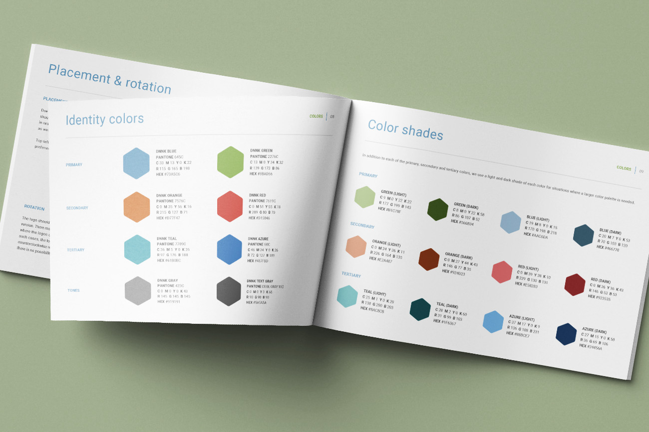
We crafted a modern, clean and very versatile visual identity which will represent DNNK both at its onset, but also as it grows and matures in time. Our conceptual approach built a lot of depth into the narrative of DNNK’s brand, which can be drawn upon when presenting the organization, its areas of activity and way of working.
Client Feedback
Søren Kasper Heinecke
Senior Consultant
The Danish Climate Adaptation Network (DNNK)
